The Power of Colors in Minimalism: How to Choose Palettes that Optimize Spaces and Create Harmony
Understanding the Impact of Colors in Minimalism
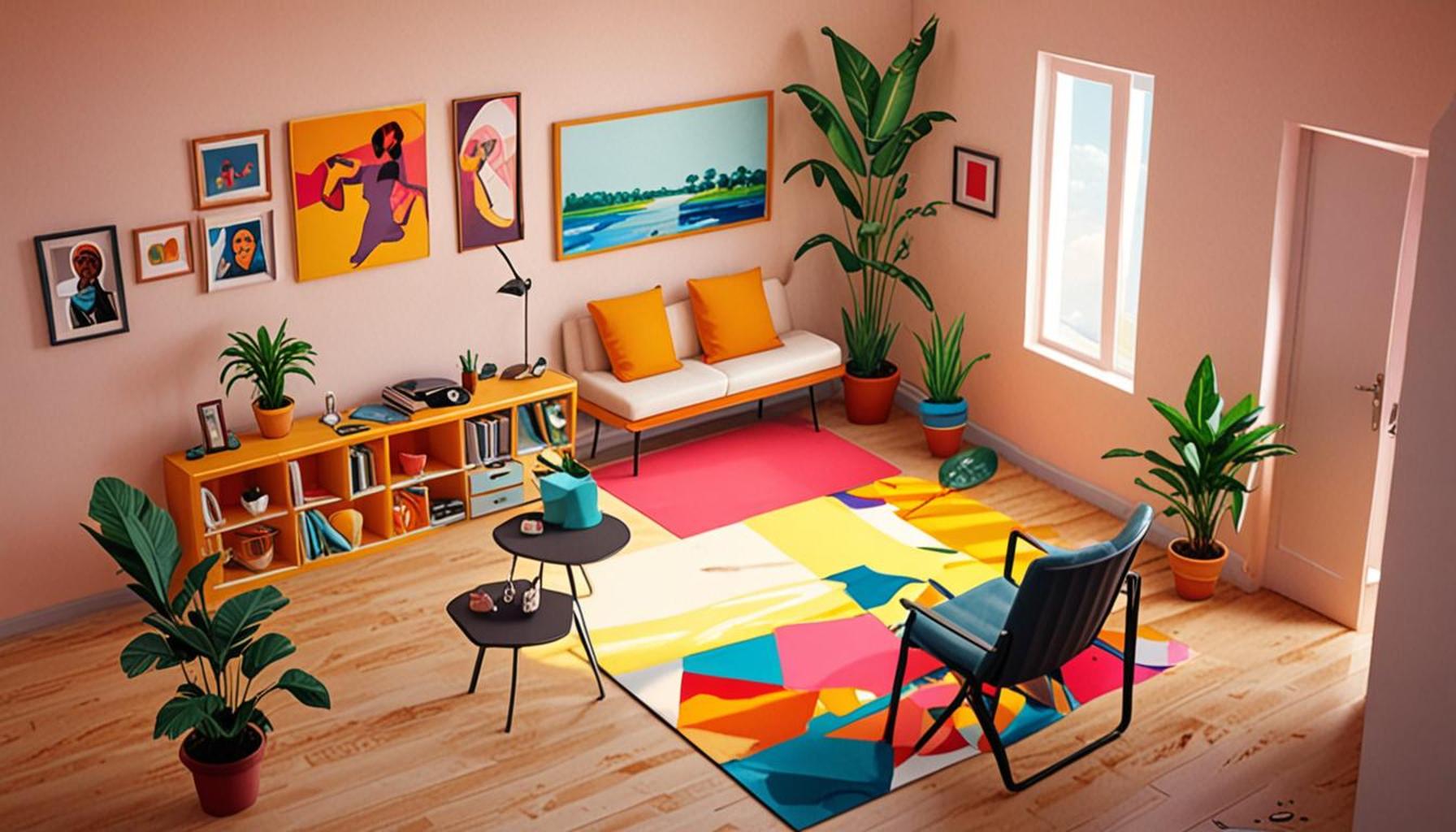
In today’s interior design landscape, where minimalism is not just a trend but a lifestyle choice, the significance of colors cannot be overstated. From serene retreats to productive workplaces, the right color choices can transform any environment. In a country like Nigeria, bursting with cultural vibrancy, the interplay of color and minimalism offers a compelling narrative that enhances the essence of both personal spaces and commercial establishments.
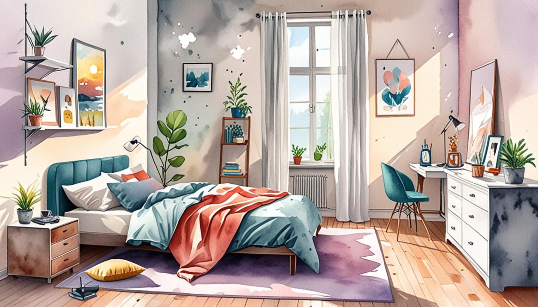
Consider the influence colors have on mood. For example, the calming effect of soft blues can create a peaceful oasis in a bustling environment, making it an excellent choice for bedrooms or meditation spaces. In contrast, vibrant yellows can invigorate a kitchen or eating area, promoting appetite and sociability. It is fascinating how a simple switch in color can either exude tranquility or energize a room, impacting the daily interactions within that space.
Cohesion Through Color Palette
The concept of cohesion in design is paramount, especially in minimalistic settings where fewer elements are present. A well-thought-out color palette ties everything together, enhancing the overall visual appeal. For instance, pairing a soft beige with accents of earthy greens can echo Nigeria’s lush landscapes and create a seamless connection between indoors and outdoors. This approach not only beautifies a space but also mirrors cultural elements, providing a subtle nod to native aesthetics.
Perception of Space
Another intriguing aspect of color choice is its impact on the perception of space. Light hues such as whites and pastels can make a room feel expansive, making them perfect for smaller apartments or rooms with limited natural light. On the other hand, using darker tones strategically can create a cozy atmosphere, ideal for intimate gatherings or restful evenings. Understanding these dynamics allows homeowners and decorators in Nigeria to optimize their living environments according to both functional and aesthetic needs.
Diving deeper into color theory reveals a spectrum of possibilities tailored to minimalist designs. For Nigerians, incorporating local color traditions can further enhance the depth of design choices. Whether it’s the warm hues of clay pots or the vibrant patterns seen in traditional clothing, there is a wealth of inspiration available. The essence of true minimalism lies not only in the choice of colors but also in the ability to reflect personal style while maintaining harmony with the surrounding environment.
As you delve into selecting your color palettes, remember: the ultimate goal is to create spaces that resonate with peace and productivity. Take these principles to heart as you explore the nuanced relationship between color, minimalism, and the unique lifestyle that thrives in Nigeria.
SEE ALSO: Click here to read another article
Choosing the Right Colors for Minimalist Spaces
When it comes to optimizing space through color in minimalistic design, the choices can be both liberating and overwhelming. In Nigeria, where the vibrant culture often bursts forth in its visuals, it may seem counterintuitive to adopt a more subdued color scheme. However, understanding the psychological effects of colors and their interactions can lead to remarkably harmonious environments.
The Basics of Color Theory
At the core of effective color selection lies color theory. This principle not only categorizes colors into primary, secondary, and tertiary but also includes concepts of temperature (warm vs. cool) and value (light vs. dark). When selecting a palette for minimalistic spaces, consider the following:
- Hue: The actual color (red, blue, green, etc.) you choose sets the mood.
- Saturation: This pertains to the intensity of the color; more subdued tones can promote calmness, fitting seamlessly into a minimalist design.
- Value: Light colors can open up spaces, while dark shades can lend warmth and intimacy.
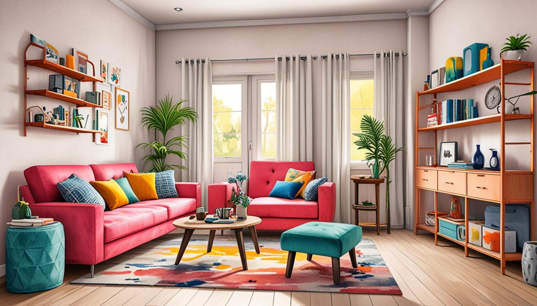
For instance, a palette dominated by soft pastels can create an airy feel, while a combination of deep greens and earthy browns can evoke a sense of groundedness, ideal for common areas where families gather. In a Nigerian context, soft neutrals combined with splashes of vibrant local colors—think the deep reds of fabric from northern Nigeria or the rich browns of the earth—can create a visual narrative that is both minimalist and culturally relevant.
Creating Emotional Connections with Color
Furthermore, colors possess the power to evoke emotions and influence behavior. The psychological impact of color should not be underestimated when decluttering a space. Different colors can inspire various feelings, impacting how inhabitants experience their environment.
Some colors and their associated feelings include:
- Blue: Calmness and stability, perfect for offices or study areas.
- Green: Renewing and refreshing, ideal for spaces promoting relaxation.
- Yellow: Cheerful and invigorating, great for encouraging social interactions.
- Gray: Modern and sophisticated; it can serve as an excellent backdrop for bolder accent colors.
In Nigerian homes, where the bustling environment can often lead to sensory overload, choosing a palette that incorporates these principles can transform living areas into sanctuaries. By opting for minimalistic design paired with thoughtful color choices, one can achieve a harmonious balance between personal preference and the existing cultural environment.
As you consider your minimalist approach to color, reflect on how each hue speaks to you personally and socially. The power of colors in minimalism is not just about aesthetic pleasure; it’s about creating spaces that nurture personal well-being and cultural appreciation.
| Color Choice | Impact on Spaces |
|---|---|
| Neutral Palettes | Create a calming atmosphere, promote focus, and enhance the sense of space. |
| Accent Colors | Add energy and personality while maintaining balance and harmony in a minimalist approach. |
When exploring the world of minimalism, understanding the interaction of colors within spaces becomes vital. A well-planned color palette not only reinforces a minimalist aesthetic but also influences how a space feels and functions. For instance, neutral colors such as whites, grays, and beiges serve not just as a backdrop but also as a medium to amplify natural light, creating an illusion of openness. By allowing these colors to dominate, one can easily enhance tranquility and clarity within a home or office. In contrast, the strategic use of accent colors such as muted blues and greens can inject vibrancy without overwhelming the senses. These colors can serve as focal points, directing attention and creating an emotional connection to the space. Whether it’s through pillows, artwork, or a single painted wall, accent shades take minimalist design to the next level, proving that less is more need not lack depth or character. Understanding how to balance these elements not only optimizes spatial perception but also fosters a deeper sense of harmony in daily living.
RECOMMENDED: Check out this similar article
Utilizing Color to Enhance Functionality in Minimalist Design
Integrating color thoughtfully into minimalist spaces extends beyond aesthetic appeal; it has a profound impact on the functionality of the environment. In Nigeria, where living spaces often need to serve multiple purposes, the choice of color can help define areas and facilitate their use. By understanding the relationship between color and spatial perception, individuals can create an efficient and harmonious atmosphere.
Color Zones for Multi-Functional Spaces
Utilizing color to delineate different zones within a single environment is an effective strategy in minimalist design. This can be particularly useful in homes, where open-plan living is increasingly popular. For instance, a living room that transitions into a workspace can benefit from distinct color applications. Consider the following:
- Cool tones like aqua or light blue can be used in the workspace to promote concentration and productivity. They can provide clarity during tasks while remaining visually cohesive with the entire room.
- Warm tones like peach or soft coral can enhance the more social areas of the living room, encouraging conversation and creating a welcoming atmosphere.
This strategy not only helps visually but also encourages the psychological separation of activities, reducing stress from multitasking in a single space. Additionally, colors that reflect natural elements, such as terracotta or mustard yellow, can draw on Nigeria’s landscape, providing warmth and familiarity without overwhelming the senses.
Maximizing Natural Light with Color
In many homes, especially in urban centers like Lagos or Abuja, natural light can be scarce. The right color palette can help compensate for this lack. Light colors (e.g., cream, pale grey, or soft white) can reflect sunlight and create the illusion of a brighter, more open area. A few tips to consider include:
- Use a light color on walls and larger furniture pieces to enhance the brightness. This approach creates a cleaner and more spacious feel.
- Highlight a feature wall with a slightly darker shade or a bolder pattern, drawing the eye and adding depth without cluttering the space.
- Opt for light-colored textiles and decor that complement the primary palette, providing texture without oversaturating the room.
In Nigeria, where the sun shines brightly for most of the year, reflecting that light can significantly elevate the home atmosphere while maintaining the minimalist ethos of simplicity and functionality.
Integrating Cultural Elements through Color
Embracing local culture can enrich minimalistic design, allowing personal identity to shine through even with a restrained palette. Incorporating traditional colors reminiscent of Nigerian textiles or artworks can add character without overwhelming the minimalist aesthetic. For example:
- A muted green or earthy tone could serve as a backdrop, framing vibrant art pieces that showcase local craftsmanship.
- Accent colors inspired by the patterns found in traditional Nigerian clothing can be incorporated into throw pillows or small decor items, offering a nod to cultural heritage.
This blend of minimalist decor with cultural colors not only serves aesthetic purposes but also fosters a well-rounded space that resonates with the inhabitants’ beliefs and traditions, creating personal harmony amidst simplicity.
In conclusion, understanding how to harmonize color choices within minimalist designs presents a pathway to curate living spaces that are visually pleasing, emotionally comforting, and deeply connected to local culture. By embracing the power of colors thoughtfully, you can turn ordinary spaces into extraordinary experiences that reflect both modern simplicity and rich cultural nuances.
CHECK OUT: Click here to explore more
Conclusion
In summary, the power of colors in minimalism is a transformative tool that goes beyond mere decoration; it is an art of optimizing spaces while fostering harmony. By understanding the psychological effects of color, individuals can design environments that enhance functionality, promote relaxation, and reflect personal and cultural identities. In Nigeria’s diverse and bustling urban landscape, the effective use of color can redefine multi-functional spaces, providing clarity and definition in homes that serve an array of purposes.
Additionally, harnessing natural light through bright, reflective palettes can create inviting and expansive areas, making any room feel more refreshing and vibrant. This approach, paired with strategically designed color zones, allows for a sophisticated balance between relaxation and productivity. By thoughtfully incorporating local cultural elements into these palettes, residents can create unique atmospheres that resonate deeply with their heritage.
As you embark on your journey of minimalist design, consider how each hue contributes to the overall narrative of your space. Choosing a cohesive color palette can eliminate clutter visually and emotionally, leading to a state of peaceful living. The harmony achieved through color not only elevates your environment but also enriches your life, proving that when color choices are made with intention, they have the power to transform ordinary spaces into extraordinary experiences. Embrace this journey, and let colors guide you towards a minimalist haven that reflects your essence.